
 June 27th, 2013
  worldoutwest
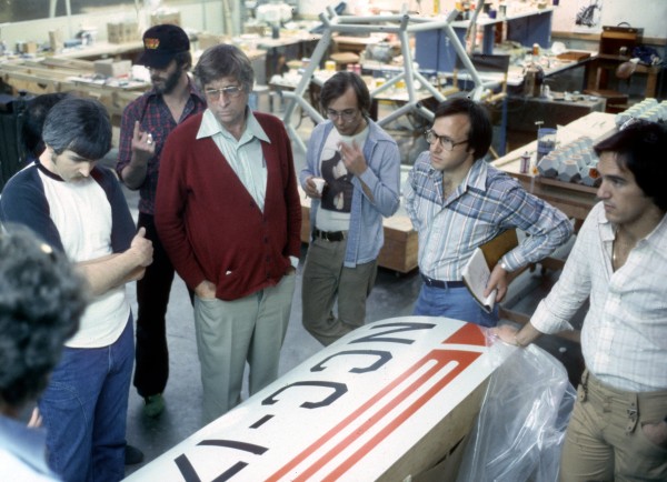
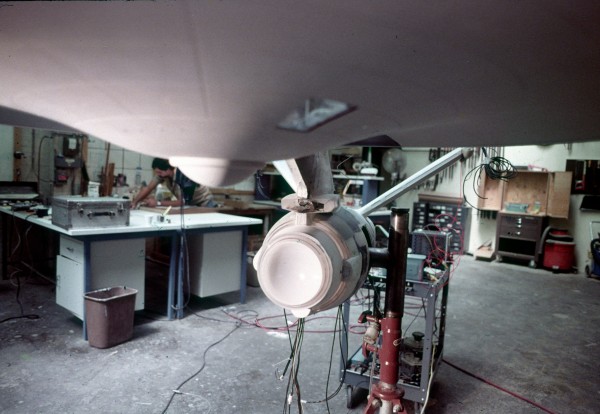
Magicam Model Review. Looking at Enterprise entrance portal model. LR, Bruce Logan, Richard Taylor, Gene Rodenberry, Mike Lawler, Unknown, Kerry Melcher.
With the recent release of Star Trek: Into Darkness in cinemas — we thought it’d be great to go back to the beginning of Trek’s cinematic journey and speak with Richard Taylor — the Visual Effects Designer on 1979’s Star Trek: The Motion Picture. In this Beyond the Marquee Exclusive, Taylor kindly shares his experiences on making the film — many of which played a significant role in the visual transformation of Star Trek from the television screen to the big screen, and he also talks about the impact that the original Star Wars movie had, and didn’t have, on the film. He’s also provided many behind the scenes photos — the majority of which have never been seen before or published. Warp Speed ahead to check them out!
Richard Taylor has received 15 Clio Awards for his work, including: 7UP Bubbles, 7UP Un-Cola, Reebok, and Levi’s Trademark commercials. He’s worked on fan favorite films including: Something Wicked This Way Comes, Tron and Looker — and has been the cinematic director at Electronic Arts, directing cinematic sequences for The Lord of the Rings: Battle for Middle Earth and its sequel, as well as Command & Conquer 3: Tiberium Wars and Command & Conquer: Red Alert 3. Recent work includes Shrek 4, Turner Classic Movies, Disney and Ubisoft Games. Presently, Taylor is the director of XLNT FX, and serves as vice-chair of the Visual Effects Society.
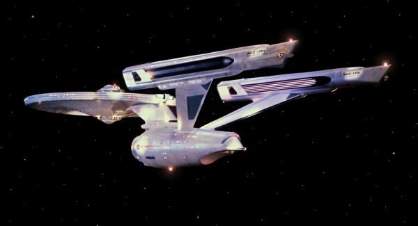
Still photo of Enterprise photo by Virgil Mirano.
Jay West: How did you first become involved with Star Trek: the Motion Picture – and were you a “Trekkie” or a fan of Star Trek going into it?
Richard Taylor: I first got involved when I was one of the main creative directors at Robert Abel and Associates. I began there in 1973 and it was a project that was brought to us by Paramount. We were contacted by Paramount to look at doing the effects. On Star Trek the feature, they had already started building sets and some models and things for what was going to be a television feature — not a new television series — but a television feature. That was generally as a result of the success of Star Wars, so it was kind of a knee-jerk reaction to take what was being developed and turn it into a full feature, a theatrical feature. So they contacted Abel Studios and I went over and met with everybody who was involved with the picture at that time and took a look at the sets and at what stage everything was.
As far as me being a Star Trek fan, I had watched the television series quite a bit. I thought it was incredibly diverse in its quality, the original television series. I mean, it shows Nomad, which part of the idea of Nomad was incorporated into Star Trek the feature, the space probe that comes on board the bridge and something like that were very much out of Nomad. But some of the other Star Trek weekly series were them running around in confederate uniforms on the back lot. There wasn’t — it wasn’t consistent. It was entertaining but I wasn’t particularly a Star Trek fan and, frankly, I’m still not.
For the feature, part of the team that was working on it was Magicam, who were a subsidiary of Paramount Pictures — Magicam being Joe Matza’s company, who had a pretty substantial model shop, so they were actually starting to work on some of the models and things. There were sets on the stages at Paramount and I took an objective look at all of that and came back with our recommendations — which was basically “scrap everything and start over,” because it was really — if you’ve seen 2001 or Star Wars, the comparison in the design and the level of detail and just everything about it was, frankly, embarrassing. They would have been laughed out of the theater had they gone on to make a film using those assets.
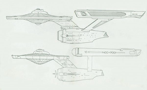
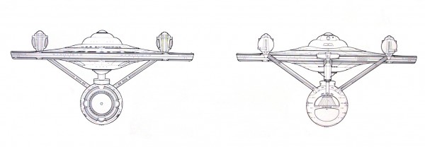
Comparison of Star Trek Television Series Enterprise and Star Trek the Motion Picture redesign. New Enterprise design: Richard Taylor, Andy Probert.
Jay: Because of the lack of detail and finesse…
Richard: It was old-school design; like curvilinear, it wasn’t modern, it wasn’t kind of white-on-white, it was dark and kind of open girders and the Enterprise model that was being made, which was the only model that was underway except for the big office complex, was just not of the caliber design-wise the way it was built — for photographic reasons it would have been not very successful. One of the major breakouts of Star Wars was the use of motion control and making multiple passes and adding streak and all those kind of lights and things as separate passes to make something much more believable and real and to give it some scale. The model that was being built really didn’t have that — I can’t remember any lights that were built into it but it was about two and a half, three feet long or something.
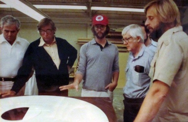
During construction of Enterprise: L to R,
Phil Rawlins, Gene Rodenberry, Richard Taylor, Robert Wise, Bob Abel.
Jay: A very small size for filming.
Richard: Very small, and if you’re going to get really close to an object, you have to have lots of detail built into it. It requires a model of much bigger scale and lighting systems and ways of armaturing the model so you can shoot it from any one of six sides. It just wasn’t going to work. So the overall designs were really pretty silly. They were starting to build the space office complex and they were kind of these hexagonal cubes — I guess it’s a hexagon. It’s, like, a 21-side surface on kind of a geodesic structure and, again, you just went “Wow. That’s not going to work.”
Jay: So it was clear right off the bat that none of it was going to be useable.
Richard: No. Just the whole level of design and everything was very old-school and just wasn’t of the level it needed to be to do a feature and to compete with the Star Wars franchise. So that’s when we got involved.
Enterprise during fabrication, Model supported by port side armature. One of five armature connection points.
Jay: The visual effect sequences are very majestic and elegant in Star Trek: The Motion Picture — and in many respects, somewhat symphonic in nature: with them going on for several minutes at a time in instances. Was that dramatic style decided early on? — versus the quick cut editing of what Lucas had done in ‘77’s Star Wars with the dogfight and the Death Star battle?
Richard: Yes, that was all part of the way the original boards were, the way the screenwriter, Roddenberry, and other people wanted it to play out. It really began with the tour of the Enterprise. That was a very long sequence, just to get him on board. It was quite indulgent. That was a long, long flight there.
Jay: I find that interesting because at that time, with Star Wars being so fresh and incredibly successful, and with so many other films trying to copy Star Wars in style, that it didn’t seem to really impact the style of Star Trek: the Motion Picture much.
Richard: No it didn’t.
Jay: Which I thought was great, all things considered, that it didn’t jump on the bandwagon and become like a Star Wars wannabe just using Star Trek as an outlet to do it.
Richard: Well, Star Wars, of course, was fighters that flew and it was dogfights in space and a lot of fighting and running and fighting and big fights. Star Trek, the very nature of the script was — it was a lot more talking heads, people sitting around pondering what the hell V’Ger is, getting Spock (Leonard Nimoy) on board, getting Kirk (William Shatner) on board, and developing the little dramatic story between the different characters. Bringing Bones (DeForest Kelley) on board and putting the crew back together. It took a lot of time for that in the movie, really. So, the first act of Star Trek is just getting everybody on the Enterprise.
The conflict, of course, is the destruction of the space stations and V’Ger’s attacks on the Klingons and so forth, so that was the first action of any kind. The rest of the first act is just getting people on board, explaining what is going on and all of that. So the very pace of the script dictated that kind of approach and Roddenberry was so in love with doing this grand tour of the Enterprise and Kirk falling in love with it again and wanting to, therefore exerting his power to take command off of Collins (Decker), which was a story point throughout. So you’re right, they didn’t really use Star Wars as an influence — in a sense, it was closer to 2001 in its pacing.
Jay: Right.
Inked blue print drawing, Richard Taylor
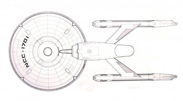
Richard: When we got involved I asked Roddenberry what I could do as far as re-inventing the look of the Enterprise, and he basically said that it had to retain a structural design that was similar to the television series, that it had to have a saucer, the large dorsal in front, the lower fuselage, the two struts, and the nacelles on it. That general configuration because that was a signature design for the franchise, and it needed to have similar configuration. It could be more detailed, the lines could change, but it had to have that configuration.

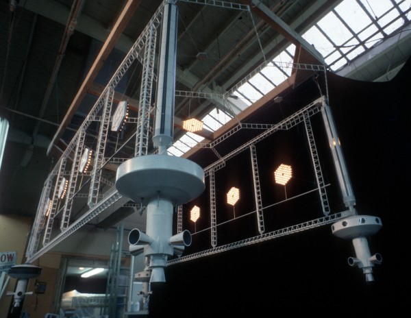
Illustration of Armature attachment for Space Office Complex model from the Miniature Manual. Artist, Engineer: Paul Krause.
Well, I had done a lot of research into spacecraft, into space structures that were being considered at that time, both by NASA and private individuals who were engineers in the space program. I had gotten books to get an idea of where the design of these things were really headed, and one of the most important things about anything in space is that if it’s in weightlessness it will rotate around its center of gravity.
The Enterprise happens to be one of the most unbalanced objects in the history of the universe. Its very configuration, its balance point is outside of itself: the fact that you have the saucer up in front and an angular strut that takes it down to a lower fuselage and then angling up are the struts for the nacelles, and then those nacelles there, it’s like a giant teeter-totter, it’s incredibly unbalanced. Even when we built the real model, which was eight feet long and was able to be armatured from six different sides, it had huge torque on it when it was armatured from the rear or from the front just because of all of that stuff hanging way out there. So it’s a very unbalanced object and the philosophy of how it works is, “Well science fiction is science fiction,” but the idea that the nacelles created a warp or a distortion in space that the Enterprise rode like a surfboard, it rides the front edge of this disturbance created by the nacelle, so you’re surfing through space in a way, all of those concepts don’t really make any sense, the very design of the enterprise itself, just the very strange design.
A lot of people like it, of course, so what I did was redesign it by making it much more elongated, more streamlined. I totally redesigned the nacelles so they weren’t, as in the original television series, like cigar containers, or circular. They were much more rectilinear and longer, a lot of parallel lines. I was very much trying to give the Enterprise an art deco look, a lot of horizontal lines, stretched things, and added a lot of detail everywhere on the surface and throughout the construction of the Enterprise, that’s one of the primary things that I did with all of the models, not just Enterprise, but adding surface detail, enlarging the models, building light systems into them so that we could make multiple passes. The Enterprise was the hero ship and the opening sequence of the film where Shatner goes up and does the grand tour of the new Enterprise was a very important sequence to Roddenberry and everyone else, to have Kirk fall in love with the new Enterprise and therefore take command back, away from Collins. So that tour around the Enterprise was really important, so it had to look really good.
Jay: Right – and reintroducing the audience to the Enterprise as well in that respect.
Richard: Exactly. But just in designing that whole sequence alone, I was very frustrated with Gene Roddenberry’s ideas about design and where we could go to push things out there. Having seen 2001 years and years earlier, to look at the Enterprise versus looking at the spacecraft in 2001, it looked dated to start off with.
Inked blue print drawing: Richard Taylor
Jay: What would you have done as different approach to that dry dock sequence as seen in the film? — with Scotty and Kirk flying up to the Enterprise in the shuttle?
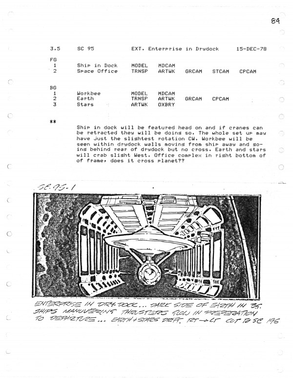
Richard: Well, I wanted it first of all to not be a rectangular, you know, a big box in space, and the center of gravity around an elongated rectangle — a rectangle in space is just not very poetic. I wanted to do, basically, a hexagonal cylinder that the Enterprise was in the middle and when you first saw it all that it was upside down and there was always this continual roll so that you could really emphasize that there is no up or down in space. To approach it when you first saw it, the whole thing being upside down and the whole thing rotating so the dry dock and the Enterprise were all rotating and the Enterprise was inside of a cross-section hexagon, an elongated hexagon shape.
Effects Storyboard Page, Artist: Ed Verreaux.
Scotty (James Doohan) flew Kirk up in a shuttle and they would do the whole grand tour around the thing. Well first of all, that had to be a spacecraft where you could see them in the window, so I had to have a large window shape in the front of that. It’s really a very silly-looking craft. The reason is because the back of it is the door than has to dock with the Enterprise. Gene Roddenberry mandated to me that the doors on the Enterprise had to be twelve foot in diameter circular doors. So right there you go, “Wait a minute. You talk to any astronaut or anyone, you wouldn’t have a twelve foot circular door,” and I said, “Well, okay, if it’s circular, how’s it going to open? Can it iris open?” “No.” He didn’t want them irising open. So how am I going to open the doors and close the doors if it’s a giant circular — you know, twelve feet in diameter, that’s as high as your ceiling in most houses, and think of that as a big round door. So the only way that it could work as a door was whatever it docked with, the panels that were closed inside of it had to pull into the skin of whatever craft it docked with. So when it docked with the Enterprise those doors were open but they pulled into the skin of the Enterprise.
So to build a cool-looking spacecraft with them — and I had to have this giant circular ass on the thing — I just thought that was silly, and that design restraint affected the Vulcan shuttle, where Spock had to come into the movie by docking directly with the bridge when the Vulcan shuttle drops him off. It does this neat little flip in the air and backs in and docks with the bridge. Again, that craft had to have a twelve foot in diameter door as a part of its design. I did put escape hatches on the top and bottom and other details to make it seem kind of reasonable but — because, what, if you had a problem in space and you had to get out of that thing, you couldn’t open the twelve foot in diameter door, right? You had to push the two door pieces off into space or something. Those are the kinds of mandates that Roddenberry would just, point blank, say, “This is what you’re going to do.”
Original Dry Dock model made for television movie. Shot during Magicam Model Review.
Jay: What were some of the other Star Trek settings and elements that you designed and/or redesigned?
Richard: I got involved in the design of the bridge and some of the other interior sets because they had to match the exterior of the Enterprise and there were shots where you had to look out from interior sets and see part of the Enterprise on the exterior, so all that stuff had to match and I needed to know the exact total layout of the interior design of the Enterprise, which we did.

Magicam Model Review. Enterprise entrance portal model.
The typeface on the Enterprise, which is still the typeface for Star Trek, that’s a type that we designed — and whether it’s the Vulcan logos or the Vulcan type or the space command’s logo, all those were designs that we did from scratch. We used nothing from the original show.
Jay: That’s an iconic font style. It has a large visual association with Star Trek.
Richard: Yeah, it’s red, white, and blue, to be American and have that military quality to it, but a little friendlier than that. We really got into a lot of detail and Andy Probert was one of my main right hand people to help on a lot of that. He was a total Star Trek fan.

Photo of original engine room set for television movie.
This set was partially redesigned for the feature.
We designed every deck and where everything was and where the main conferencing room was when everybody was there when they showed V’Ger destroying the space stations, when Kirk called the whole crew together before they go off. Those kind of spaces, we had to know — and of course, the engine room and all of that. But the bridge being the most important set of them all — for me watching the original television series I thought the people in it were probably the most stupid people in the history of the universe in that they stood around on this bridge and whenever they got into any turbulence or anything they all fell around on the floor, grabbed onto stuff, and acted like they were being buffered around.
Every aircraft, every car, everything on this planet or anywhere we have some kind of seat that folds around you or seatbelts or something to hold you in place. You don’t just go flopping around the bridge, what they did in the television show. So when we got into the bridge, I had some drawings done and wanted to have that navigational sphere hanging down in the center, which he went along with. I wanted to have the viewscreen more horizontal and larger. I wanted to have a lot of curvilinear quality to the design of the bridge. But the first thing was the actual command chairs that they sat in: I wanted those to have arms that, when they got into an emergency, folded up over them and therefore held them in there. Rodenberry eventually agreed to that. Initially, he didn’t want that — but he eventually agreed that was probably a good idea. Any craft, and flying craft or car, you have safety harnesses or seats or things that keep you in position when you get into turbulent situations.
Jay: Even Han Solo on the Millennium Falcon said, “Strap yourself in!,” right?
Richard: Exactly. Exactly. So — or even have Velcro shoes like they did in 2001, but people were strapped in in 2001 so I got the chairs redesigned on the bridge. The next thing was the basic console there, where Sulu and all the rest of the crew on the bridge were. I had seen all this design work that was being done for Lawrence Livermore and other places were tactile screens were evolving, going to be the next rage in communications and control systems for nuclear reactors. Tactile screens, where you touch them and different arrays play out and then you touch buttons and slide things around, as we do now.

Magicam Model Review. Dry Dock lite panels from original Dry Doc Model. Center, Gene Rodenberry, rt. Richard Taylor.
So I suggested that to Roddenberry. He said, “No, no, no. I want screens all the way around the perimeter of the bridge with Sulu and people like that” — he absolutely did not want tactile screens. I said, “Great, we’ll make rectangular screens that are all sort of interconnected“ — he said, “No, no, no. They have to be round screens and/or oval screens”. I said, “Well, your highness, it’s really not the best shape to put a lot of information. A rectangular screen contains a lot more information than a round screen: most type, most data. Rectilinear. To put that stuff on a round screen is not efficient.” He said, “Do it.” He wanted lots of kind of colorful stuff happening on there. Most of it didn’t make any kind of logical sense.
My problem is I tend to go to logic to make science fiction design and make it really beautiful as someone like Syd Mead does. There’s basically function underlying the design of whatever you’re doing. Same way with the control panels there: he didn’t want that to be a tactile screen surface. He wanted switches, he wanted buttons and switches. Literally, buttons that you push and handles that you pull back and dials and that kind of stuff. That’s what they got. So there were some very, very specific constraints on the design of most of the models for the film. The one I was most happy with was the Vulcan shuttle. I designed it after a catamaran, and then the shuttle itself would jettison. The way it did its choreography of kind of flipping around, had a much more weightless quality to it. The worker bee ships were cool, they were a neat design. The space office complex was pretty safe. So some of the designs I was able to work out. He didn’t care — “Worker bees? Do whatever you want with those.” Anything involving the Enterprise, he really had his finger on.

Still photo of Vulcan Shuttle, design Richard Taylor, Andy Probert, Photo by Virgil Mirano.
Click HERE to go to part 2 – the conclusion of this article! Warp Speed – engage!
We’d like to thank Jay West for conducting the interview. West has worked in the film industry for studios such as Paramount Pictures and Nickelodeon — and has written for various movie related publications and websites: including the LA Times — regarding film, pop culture, and movie memorabilia collecting — West himself being a collector over 35 years.
You can visit Richard Taylor’s website by going here: http://richardtaylordesign.com/
Live Long and Prosper!
 Posted in


The “unknown” person in the top photograph is, I believe, Stuart Ziff.
Hi! I would really like to know if anyone knows just where the original 8-foot model from ST-TMP is today? It seems to have warped away to another galaxy entirely!
Tony Robinson
I don’t know who bought it but it was sold through Christie’s Auction in 2006. Check this out: https://www.youtube.com/watch?v=Dy7mLaVhO9I
Thaks for de photos. Is history.
OUTSTANDING !! Great article 😀
[…] Trek geek red alert! This is an outstanding, in-depth article about the special effects of Star Trek: The Motion Picture, including a focus on the brilliant redesign of the USS Enterprise for […]
That Richard Taylor is certainly one bitter Gene Roddenberry hating cretin. He complains about every decision Gene wanted in this article but I bet never did it to Gene himself or his ass would have been out the door.
Sorry Princess,
He’s not a bitter cretin but a talented designer intelligently commenting on the frustrations of working for a hack writer/impotent producer ignorant of even the most basic elements of design. His comments echo those of almost everyone who dealt with Roddenberry and illustrate perfectly why the film was such a half-assed train wreck ripped off from a lousy episode of the show.
Daft Punk needs to hire Richard Taylor to direct an analog glow music video for “Get Lucky” in the vein of Abel and Associates’ work on “Can You Feel It” for The Jacksons.
[…] which have never been seen before or published! Click ahead to read part two of our interview. And Click HERE at Warp Speed to revisit part one if you missed it. […]
[…] Model #78 Hey, just wanted to link this in case you missed it. Some very interesting pics. [EXCLUSIVE] pt.1 ? Interview with Visual Effects Supervisor Richard Taylor re: 1979?s Classic Star T… Reply with […]