November 18th, 2011
  DaveWill
 In my last post I put forward the argument that modern day posters just don’t cut it anymore. So many movie posters released lately have really wasted their potential and missed out on an opportunity to stand out from the crowd . They could potentially have been timeless works of art, but instead they often turn out to be badly Photoshopped combinations of cut out bodies and poor typography.
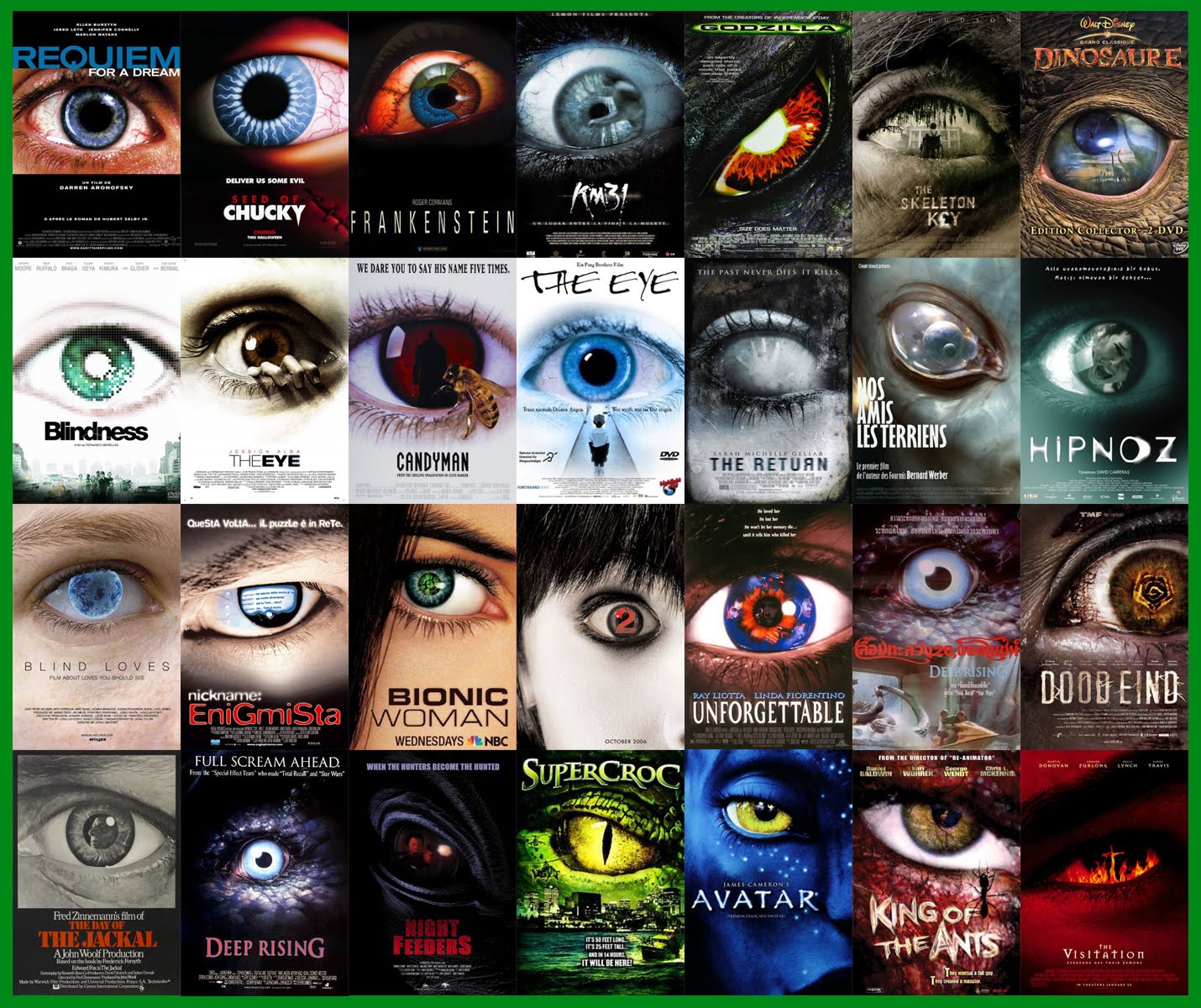
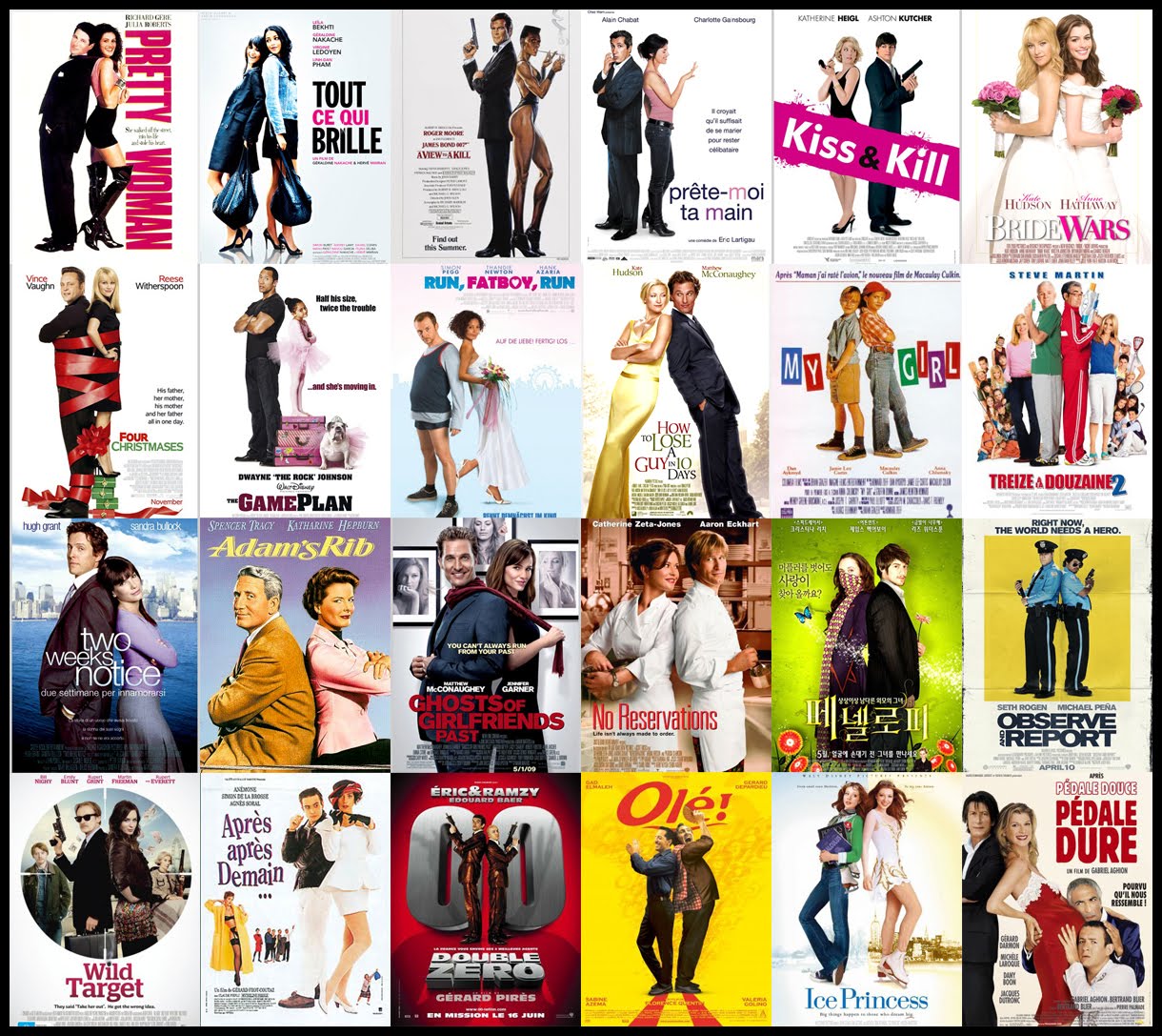
A few days after this mini-rant of mine, I came across a brilliant article that really backs up my point. Christophe Courtois has created a list of the 13 most over used styles within poster design and it really highlights the lack of imagination and creativity from so many movie studios. A selection of images are posted below but to see even more check out Christophe’s site here. It’s quite the collection…
THE EYE
BACK TO BACK
TEXT IN THE WAY

So what do you think? Am I being too harsh? Maybe some are intentional references to earlier movies but isn’t it a shame that so many others just follow a familiar format?
Does it even matter? Would a poor poster design influence your decision to see a movie?Is it possible to still be ‘original’ when there are literally hundreds of new movies released every month?
Get involved and leave a comment below! Thanks for reading! 🙂
 Posted in